Angular Signal Forms Series: Key Features of Signal Forms
Angular introduced the long-awaited Signal Forms in v21. Let's explore the advanced features and learn how to implement complex validators, nested forms, and custom form controls in real-world applications.
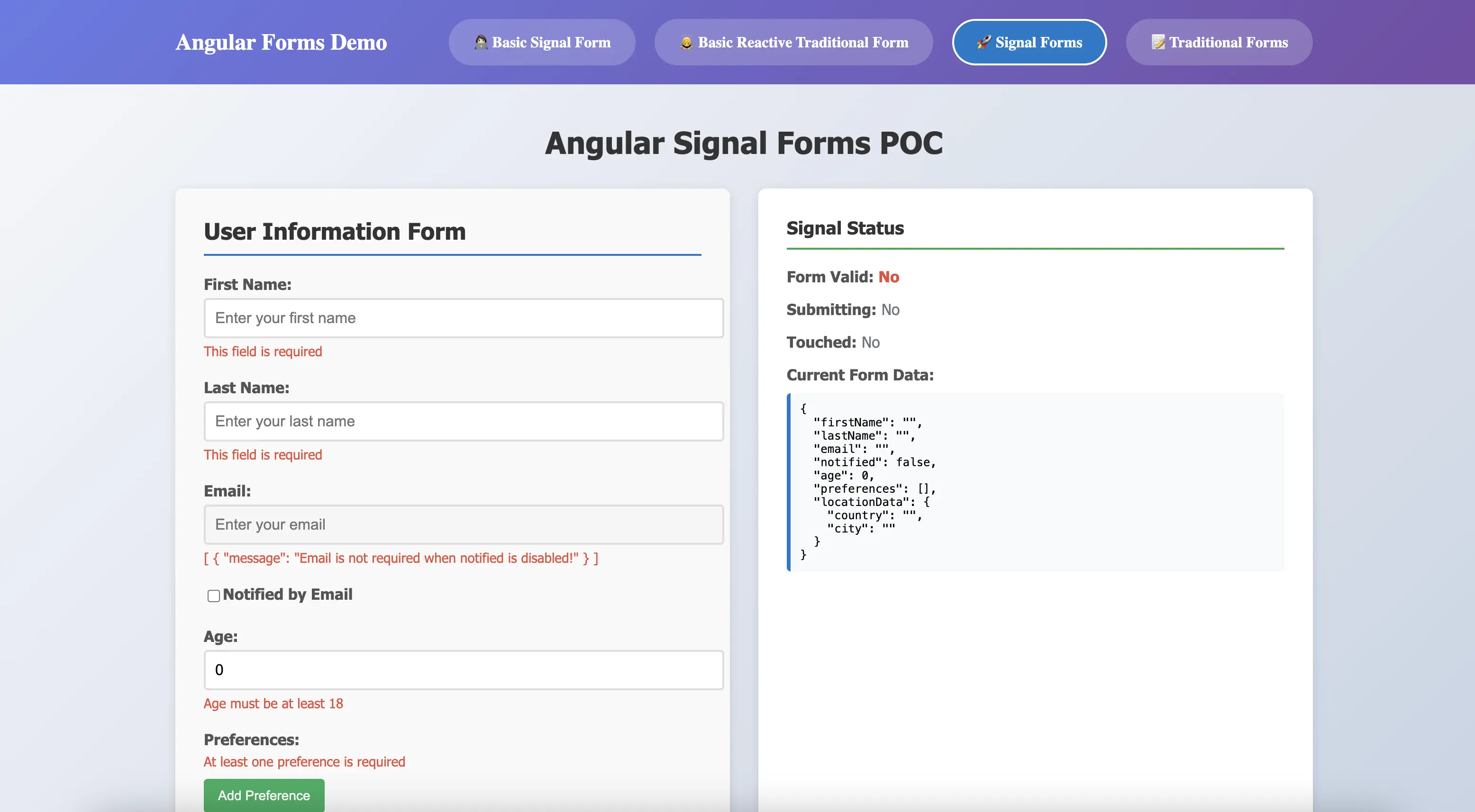
Throughout this article, we'll build a comprehensive user registration form that demonstrates key Signal Forms capabilities:
- Basic fields: First name, last name, and age with standard validations
- Email notifications: Conditional email field that appears when notifications are enabled
- User preferences: Dynamic array of preference items with individual validation
- Nested location: Complex object combining country and city information
This practical example will guide you through implementing validation strategies, reusable schemas, nested form structures, and custom form controls.
Reusable Validation Schemas
Schemas enable you to define reusable validation logic that can be consistently applied across multiple forms and fields, significantly reducing code duplication and ensuring uniform validation behavior throughout your application.
Single Field Schema
Define schemas for individual fields that can be reused anywhere in your application. The following example demonstrates creating a reusable nameSchema that can validate any name field across different forms:
const nameSchema: Schema<string> = schema((path) => {
  required(path, { message: 'This field is required' });
  minLength(path, 2, { message: 'Name must be at least 2 characters' });
});

// To apply the schema to the form
userForm = form<User>(this.user, (path) => {
  apply(path.firstName, nameSchema);
  apply(path.lastName, nameSchema);
});
Multi-Field Schema
When multiple related validations need to be grouped and reused across your application, multi-field schemas provide an elegant solution. For instance, user name validation often involves both first name and last name fields. By combining individual field schemas, you can create comprehensive validation rules for complex objects:
const userNameSchema: Schema<User> = schema<User>((path) => {
  apply(path.firstName, nameSchema);
  apply(path.lastName, nameSchema);
});

// Apply the schema to your form
userForm = form<User>(this.user, (path) => {
  apply(path, userNameSchema);
  apply(path.email, emailSchema);
});
Conditional Schema Application
Schemas can be applied conditionally based on runtime conditions, allowing dynamic validation behavior that responds to user interactions or application state. The following example demonstrates email validation can take effect only when notified checkbox field is checked:
const emailSchema: Schema<string> = schema((path) => {
  required(path, { message: 'Email is required' });
  email(path, { message: 'Please enter a valid email address' });
});

userForm = form<User>(this.user, (path) => {
  applyWhen(
    path,
    (ctx) => ctx.valueOf(path.notified) === true,
    emailSchema
  );
});
Array Schema
For forms containing arrays of items, use applyEach to apply validation schemas to each element in the collection. This ensures consistent validation across all array items. To add validation to user preferences, each preference item needs to apply the same validation:
userForm = form<User>(this.user, (path) => {
  applyEach(path.preferences, (path) => {
    apply(path, nameSchema);
  });
});
Validators
Built-in Validators
Signal Forms include a comprehensive set of validators for common validation scenarios. In the above schema examples, built-in validations have been used. Each validator is type-safe and provides clear, customizable error messages:
required(path.field)- Ensures the field has a valueemail(path.field)- Validates email formatminLength(path.field, n)- Enforces minimum character lengthmaxLength(path.field, n)- Enforces maximum character lengthmin(path.field, n)- Sets minimum numeric valuemax(path.field, n)- Sets maximum numeric valuepattern(path.field, regex)- Validates against a regex pattern
Here's how to combine multiple validators for comprehensive field validation:
userForm = form<User>(this.user, (path) => {
  // Username validation
  required(path.firstname, { message: 'First name is required' });
  minLength(path.firstname, 2, { message: 'First name must be at least 2 characters' });

  // Age
  required(path.age, { message: 'Age is required' });
  min(path, 18, { message: 'Age must be at least 18' });

  // Email
  email(path.email, { message: 'Please enter a valid email' });
});
Conditional Validation
One of the most powerful features of Signal Forms is the ability to apply validations conditionally based on other field values or application state. This eliminates the need for complex imperative logic and keeps your validation rules declarative and reactive.
Conditional Logic - applyWhen
The applyWhen function allows you to apply validations only when a specific condition is met. It accepts a signal that returns a boolean value, making your validation rules fully reactive.
Condition Based on Field Value - applyWhenValue
When your condition depends on a specific field's value, applyWhenValue provides a cleaner syntax by automatically tracking that field's signal.
Programmatic Field Disabling - disabled
Control when fields should be disabled based on application state or other field values. Disabled fields are excluded from form submission.
userForm = form<User>(this.user, (path) => {
  disabled(path.email, (ctx) =>
    ctx.valueOf(path.notified) === false
      ? 'Email is not required when notified is disabled!'
      : false
  );
});
The disabled reason can be retrieved from the field state and displayed in the template:
@if (newUserForm.email().disabled()) {
  <div class="error-message">
    {{ newUserForm.email().disabledReasons() | json}}
  </div>
}
readonly - Make Fields Non-Editable
Mark fields as read-only while still displaying their values. Unlike disabled fields, read-only fields are still included in form submission.
hidden - Conditionally Hide Fields
Control field visibility without removing them from the form structure. This is useful for progressive form disclosure patterns.
Complex Validation
Beyond built-in validators, Signal Forms support sophisticated validation scenarios including custom synchronous validators, asynchronous validators for server-side checks, and multi-field validation logic.
Custom Validation: validate
Create custom synchronous validators for business logic that isn't covered by built-in validators. The validate function receives the field value and returns an error object or null. The following example demonstrates how to ensure the preferences array contains at least one item:
userForm = form<User>(this.user, (path) => {
  validate(path.preferences, (ctx) => {
    const preferences = ctx.valueOf(path.preferences);
    if (!preferences || preferences?.length === 0) {
      return {
        kind: 'custom',
        message: 'At least one preference is required',
      };
    }
    return null;
  });
});
Async Validation: validateAsync
Perform server-side validation tasks such as checking username availability or validating against external APIs. Async validators work with Promises or Observables, enabling integration with backend services.
userForm = form<User>(this.user, (path) => {
  validateAsync(path.email, {
    params: (ctx) => ({
      value: ctx.value(),
    }),
    factory: (params) => {
      return rxResource({
        params,
        stream: (p) => {
          return validateEmailNotInUse(p.params.value);
        },
      });
    },
    onError: (result, ctx) => {
      if (!result) {
        return null;
      }
      return {
        kind: 'custom',
        field: ctx.field,
        message: 'Email is already in use',
      };
    },
    onSuccess: (result, ctx) => {
      return null;
    },
  });
});
Multiple Field Validation: validateTree
Validate relationships between multiple fields or perform complex cross-field validation. This is particularly useful for inter-dependent form fields. The following example demonstrates how to ensure first name and last name are not identical:
userForm = form<User>(this.user, (path) => {
  validateTree(path, (ctx) => {
    const invalidName =
      ctx.valueOf(path.firstName) === ctx.valueOf(path.lastName) &&
      ctx.valueOf(path.firstName) !== '';
    if (!invalidName) {
      return null;
    }
    return {
      kind: 'custom',
      field: ctx.field.lastName,
      message: 'First name and last name cannot be the same',
    };
  });

  apply(path.preferences, (path) => {
    debounce(path, 2000);
  });
});
Debounce Validation: debounce
For fields that trigger expensive validations (especially async validators), debouncing prevents excessive validation calls while users are actively typing. The debounce function delays validation execution until the user stops typing for a specified duration, improving both performance and user experience.
This is particularly useful for:
- Search fields that query backend APIs
- Username/email availability checks that make server requests
- Complex calculations that are computationally expensive
- Array fields where users add multiple items in quick succession
The debounce delay is specified in milliseconds. In the following example, validation for the preferences array is debounced by 2000ms (2 seconds), ensuring that validation only runs after the user has finished making changes:
userForm = form<User>(this.user, (path) => {
  apply(path.preferences, (path) => {
    debounce(path, 2000);
  });
});
Nested Forms
Nested forms enable you to break down complex forms into reusable, maintainable components. Let's create a nested form for managing the preferences array. First, create an Angular component with a form template. The component requires an input property of type FieldTree to receive the form field from its parent:
@Component({
  selector: 'app-preferences',
  imports: [CommonModule, Field, ReactiveFormsModule],
  templateUrl: './preferences.component.html',
  styleUrls: ['./preferences.component.scss'],
})
export class PreferencesComponent {
  preferencesForm = input.required<FieldTree<string[], string>>();

  preferences = computed(() => this.preferencesForm()().value);
}
<div class="form-group">
  <label>Preferences:</label>
  @for (preference of preferencesForm(); let i = $index; track $index) {
    <div class="preference-item">
      <div class="preference-input-item">
        <input
          [field]="preferencesForm()[i]"
          type="text"
          placeholder="Enter preference">

        @for (error of preferencesForm()[i]().errors(); track error) {
        <div class="error-message">
          {{ error.message }}
        </div>
        }
      </div>
      <button type="button" (click)="removePreference(i)" class="remove-btn">Remove</button>
    </div>
  }
  @for (error of preferencesForm()().errors(); track error) {
  <div class="error-message">
    {{ error.message }}
  </div>
  }
  <button type="button" (click)="addPreference()" class="add-btn">Add Preference</button>
</div>
In the parent form template, simply pass the form field to the nested component:
<app-preferences [preferencesForm]="userForm.preferences"></app-preferences>
Custom Form Control
While browsers' built-in form controls (input, select, textarea) handle common cases, applications often require specialized inputs. Signal Forms seamlessly integrates with any component that implements specific control interfaces.
A control interface defines the properties and signals that enable your component to communicate with the form system. When your component implements these interfaces, the [field] directive automatically connects your control to form state, validation, and data binding.
Let's build a custom location form control for our user form. This control will group country and city inputs and can be reused throughout the application. To create this, we implement FormValueControl<Location>. The value model is the only required property—it must be a model() signal that stays synchronized with the bound FieldTree.
To access the field from the parent form, inject the Field directive. Calling this.fieldDirective.field() retrieves the FieldTree bound to your component:
@Component({
  selector: 'app-location-form',
  imports: [CommonModule, Field],
  templateUrl: './location-form.component.html',
  styleUrls: ['./location-form.component.scss'],
})
export class LocationFormComponent implements FormValueControl<Location> {
  readonly value = model<Location>({ city: '', country: '' });

  protected get locationField(): FieldTree<Location> {
    return this.fieldDirective.field() as any;
  }

  protected get cityField() {
    return this.locationField.city;
  }

  protected get countryField() {
    return this.locationField.country;
  }

  private readonly fieldDirective = inject(Field);
}
Using the custom location form control is identical to using standard input fields:
<app-location-form class="field-group" [field]="newUserForm.locationData"></app-location-form>
Note that validation logic should be defined in the parent form, not within the custom control component:
userForm = form<User>(this.user, (path) => {
  apply(path.locationData, (location) => {
    required(location.country, { message: 'Country is required' });
    required(location.city, { message: 'City is required' });
  });
});
Conclusion
Signal Forms mark a significant evolution in Angular's approach to form management, bringing several compelling benefits:
- True Reactivity: Signal-based architecture provides automatic, fine-grained reactivity without manual subscription management
- Type Safety: Enhanced TypeScript support catches errors at compile time and provides better IDE autocomplete
- Simplified API: Declarative validation and field configuration reduce boilerplate and improve code readability
- Better Performance: Signal-driven change detection optimizes rendering for complex forms
- Modern Patterns: Seamless integration with Angular's signal-based future ensures long-term compatibility
While Signal Forms are currently experimental, they offer a glimpse into the future of Angular development. For new projects or greenfield features, experimenting with Signal Forms can provide valuable insights and prepare your team for the eventual stable release. However, for production applications, remain mindful of the experimental status and potential API changes.
For existing applications built on Reactive Forms, there's no immediate pressure to migrate. The hybrid approach allows you to adopt Signal Forms gradually, form by form, as your project evolves.
Resources for Learning More:
- Angular Signal Forms Documentation
- Angular Custom Controls
- Signal Forms POC Repository - Access the full POC example here.
As Angular continues to evolve toward a fully signal-based architecture, Signal Forms represent not just a new way to handle forms, but a fundamental shift in how we build reactive, type-safe Angular applications. The future of forms in Angular is reactive by default, type-safe by design, and simpler than ever before.